Make Recruiters Read Your Executive LinkedIn Banner in 30 Minutes
Your executive LinkedIn banner needs to communicate one clear value proposition in five to ten words, nothing more. The fastest path there is a template sized at exactly 1584 × 396 pixels, customized with your title or offer and exported clean, or a three-sentence brief handed to a designer. Either route, done right, changes how recruiters and prospective clients read your credibility before they’ve read a word of your profile.
Key Takeaways:
- Using the correct personal banner size of 1584 by 396 pixels ensures your message remains clear and unclipped across devices, while company banners need a different dimension.
- Exporting banners as PNG improves logo and text clarity, and keeping files under 8MB prevents compression issues that can distort visuals.
- Prioritizing message simplicity, contrast, and safe-zone placement for text helps ensure your key information is readable on both desktop and mobile screens.
- A quick template-based design can be completed in under 30 minutes, but a custom designer may take several days and offers more coordinated branding.
- The banner should convey a single, clear message; overloading it with multiple tags, logos, or calls to action diminishes its effectiveness and clarity.
Table of Contents
- Executive LinkedIn Banner Sizes, Safe Zones, and Upload Checklist
- Design Principles That Separate Executive Banners From Amateur Ones
- Role-Based Banner Ideas You Can Copy Today
- Templates, Free Photos, or a Designer: Choosing Your Production Route
- A Recruiter’s Take on the Banner Brief That Actually Works
- How Long Should a Banner Actually Take?
- The Banner Rule Most Executives Get Backward
- Get Your Entire LinkedIn Profile Working as One Cohesive Pitch
- Quick Reference Links
- Sources
- FAQ
Executive LinkedIn Banner Sizes, Safe Zones, and Upload Checklist
Get the dimensions wrong and LinkedIn crops your best work into something illegible on a phone. The recommended personal banner size is 1584 × 396 pixels, a 4:1 aspect ratio. Company pages use a different spec entirely: 1128 × 191 pixels, a squatter ratio built for logos and taglines rather than portrait-style compositions. If you manage both a personal profile and a company page, design them separately. Stretching one file to fit both slots distorts text and blurs logos.
Export as JPG or PNG. PNG holds up better for text and logos because it avoids compression artifacts around sharp edges; JPG works fine for photography-heavy backgrounds where file size matters more than crisp lines. Keep the file under 8MB, though most well-optimized banners land well under 1MB without any visible quality loss.
The safe zone matters more than the dimensions themselves. Your profile photo sits in the bottom-left corner and covers a meaningful chunk of that area on desktop and even more on mobile, so LinkedIn’s own guidance is to keep critical text and logos centered and away from the edges, never tucked into corners where cropping or the photo overlay will hide them.
Before you consider the banner finished, run it through this checklist:
- Export at full resolution, not a scaled-down preview file.
- Check the compressed file size and re-export if LinkedIn flags it as too large.
- Preview on desktop first, then pull up your own profile on a phone.
- Confirm your headline text and any logo aren’t clipped by the photo circle or the edge crop.
Complete profiles with a custom banner and photo tend to see more profile views and connection requests than default templates, which is reason enough to get the specs right the first time instead of re-uploading three times after launch.
Design Principles That Separate Executive Banners From Amateur Ones
Simplicity wins every time. Design experts consistently point to clean typography, one or two brand colors, and layouts that hold up on both desktop and mobile as the baseline for a banner that reads as professional rather than DIY. Cap your text at five to ten words. If you’re tempted to list three services, a mission statement, and a tagline, cut two of them.
Pick a background and text color combination with real contrast. White or light gray text on a dark navy or charcoal background reads instantly at any screen size. Text laid over a busy photograph, by contrast, disappears the moment someone views it on a phone screen at arm’s length.
Composition follows a simple hierarchy: headline text sits centered or right of center, away from where your profile photo will sit. If you’re including a small logo, tuck it into the top-right or dead center, never bottom-left. Client logos or trust badges, if you use them at all, belong in a thin strip along the top edge, small enough to signal credibility without competing with your main message.
Pro Tip: Screenshot your draft banner, shrink it to thumbnail size on your phone, and squint at it from three feet away. If you can’t read the headline at that distance, neither can someone scrolling LinkedIn on their commute.
Here’s what kills an otherwise good banner:
- Low-resolution stock photos that pixelate the moment they’re stretched to 1584 pixels wide.
- Fonts under 40 points that vanish on mobile screens.
- Icon walls cramming five services into one crowded strip.
- Taglines pushed to one edge instead of centered in the safe zone.
- Text or a call-to-action positioned where the profile photo circle will sit on top of it.
Executives frequently overload their banner with decorative elements when the highest-performing versions highlight a single clear message and one supporting proof point, nothing else competing for attention.
Role-Based Banner Ideas You Can Copy Today
Different roles call for different visual shorthand. A curated set of concepts, from city skylines to minimalist solid colors, gives you a starting menu rather than a blank canvas. Here’s how to adapt that thinking by role:
- Founder/CEO: Solid brand-color background, company name and one-line mission statement, small logo top-right.
- Fractional executive: Dark background, “Fractional CFO | Scaling B2B SaaS from $5M to $50M,” no photo needed since the headline carries the message.
- Management consultant: Muted geometric pattern, three service pillars in small type along the bottom edge, well clear of the profile photo.
- Head of sales: Bold accent color, a single metric (“Built 3 sales teams from 0 to $20M ARR”), right-aligned text.
- Product leader: Clean gradient, product category name plus “12 years shipping enterprise platforms.”
- Job seeker (executive level): Simple color block, target role and specialty (“Seeking VP Operations | Manufacturing & Supply Chain”), no company logos since you’re between roles.
- Speaker or thought leader: Photo of you presenting, cropped tight, with your signature talk topic as a short line of text.
- Board member or advisor: Minimal charcoal background, “Board Advisor | Fintech & Payments,” letting restraint signal seniority.
Swap concepts when your situation changes: a rebrand, an active job search, or an upcoming speaking engagement each calls for a different message. Keep your banner’s tone matched to your headline. A banner promising thought leadership paired with a headline that only lists a job title reads as disconnected.
Templates, Free Photos, or a Designer: Choosing Your Production Route
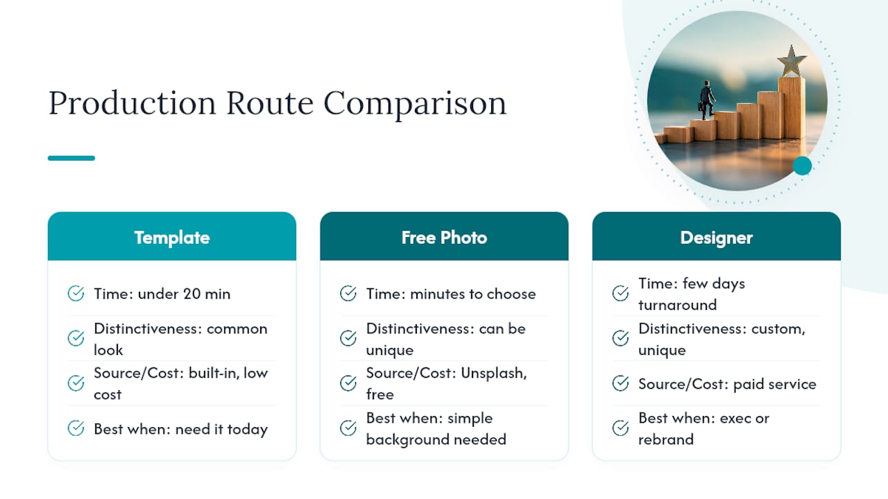
Template tools like Canva get you from blank page to finished banner in under twenty minutes. Pick a pre-sized LinkedIn banner template, swap in your text and brand color, and export directly at 1584 × 396. The tradeoff is that thousands of other profiles are pulling from the same template library, so your banner may look familiar to anyone who’s scrolled LinkedIn recently.
If you’re sourcing your own background image, free libraries like Unsplash offer thousands of banner-appropriate photos cleared for commercial use. Avoid busy scenes with lots of visual noise. A subtle gradient, a simple texture, or a wide-angle shot with negative space on one side gives you room to overlay text without it fighting the image for attention.
Hiring a designer or a managed branding service makes sense when you’re a public-facing executive, mid-rebrand, or simply out of time. Give the designer a brief that names three things: the one message the banner must convey, your brand color hex code, and the safe-zone constraint. Turnaround for a single banner from a freelance designer typically runs a few days; a coordinated package covering your banner, headline, and About section takes longer but solves more at once.
Here’s the quick decision test: need it today? Use a template. Need your whole profile to read as one coherent brand? Bring in a specialist.
A Recruiter’s Take on the Banner Brief That Actually Works
Kim Taynor, founder of Resume Wiz, spent more than 10 years recruiting before building a career services practice around executive branding. That vantage point makes one thing obvious: a designer brief that's too vague produces three rounds of revisions and a banner that still misses the mark.
Paste that structure into an email to any designer and you’ll skip the guessing entirely. Once it’s live, test two versions for four weeks, one leading with a results metric, one leading with your title and specialty, and watch which one moves profile views and inbound messages.
How Long Should a Banner Actually Take?
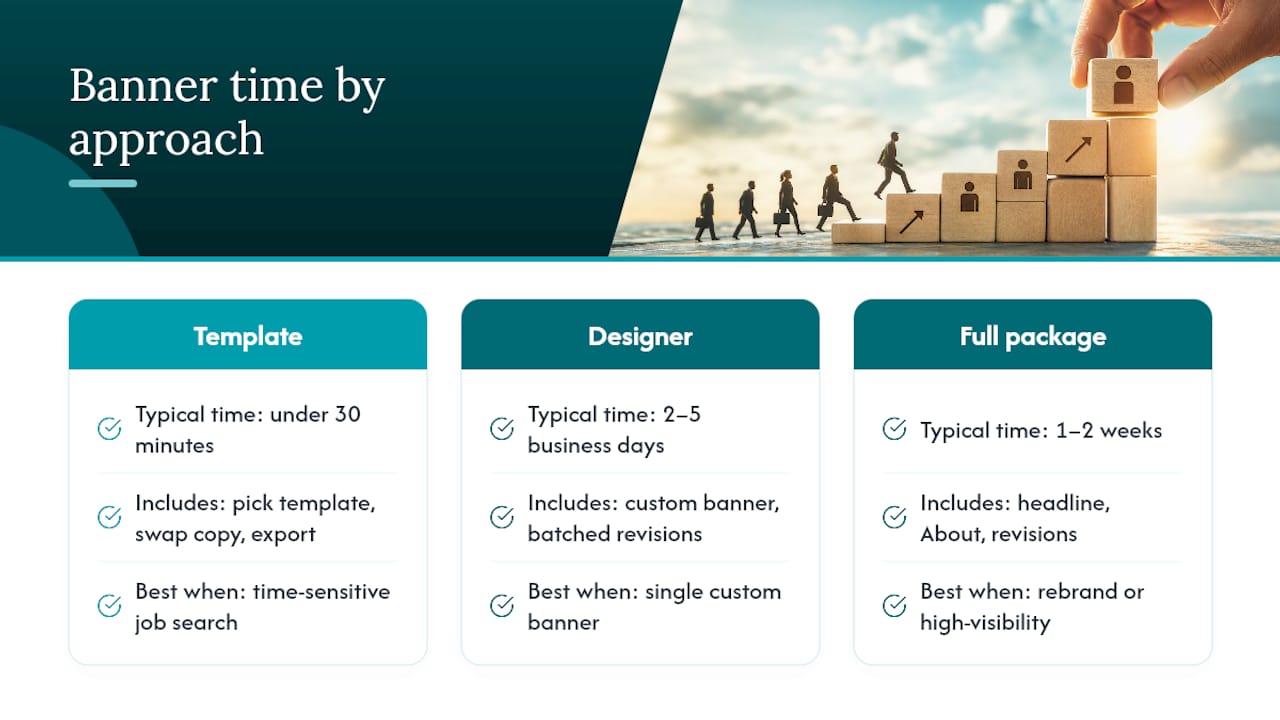
A template-based banner should take under 30 minutes from blank screen to upload, assuming you already know your headline text and brand color. That includes picking a template, swapping in copy, and exporting at the correct resolution.
Commissioning a designer runs longer. A single custom banner typically takes two to five business days once you’ve sent a clear brief, largely because most designers batch revisions rather than turning single-banner requests around same-day. If you’re bundling the banner with a headline rewrite and an About section refresh as part of a full profile overhaul, budget one to two weeks for the complete package, including a round of revisions.
The bottleneck almost always sits on the client side, not the designer’s. Executives who show up with a vague request (“make it look professional”) burn through three or four revision cycles hunting for a direction they never defined upfront. Executives who show up with a one-paragraph brief, like the one above, often get it right on the first pass.
If you’re job searching and time-sensitive, the template route wins on speed every time. If you’re mid-rebrand or preparing for a high-visibility moment like a board appointment or a conference keynote, build in the extra week for a coordinated, designer-led package rather than rushing a DIY version out the door.
The Banner Rule Most Executives Get Backward
Most advice on this topic treats the banner as decoration, something to fill once the headline and About section are done. That’s backward. The banner is the first visual signal a viewer processes, before they’ve read a single word, and human reviewers form that impression even when automated recruiter tools skip past the banner entirely.
The conventional advice to “make it look nice” also misses the real failure mode. Banners don’t fail because they’re ugly. They fail because they try to say four things at once: a mission statement, three service lines, a logo, and a call to action, all crammed into a strip of pixels most people glance at for two seconds. Restraint is the skill here, not design talent.
If you take one thing from this, prioritize message clarity over visual polish. A plain navy background with one sharp line of text beats an elaborate collage every time it’s tested against real viewers.
Kim
Get Your Entire LinkedIn Profile Working as One Cohesive Pitch
A banner alone only carries so much weight if your headline and About section don’t back it up. Some services build executive LinkedIn profiles as a single package: banner design matched to your positioning, a headline rewrite that pairs with it, and About copy that mirrors the language already on your resume.
That alignment matters more than most executives realize. A recruiter who lands on your profile after reading your resume expects the same story in both places, same numbers, same positioning, same tone. When the banner, headline, and About section all say something slightly different, it reads as three people wrote your profile instead of one. This approach saves the back-and-forth of hiring a designer for the banner, a copywriter for the headline, and doing the About section yourself at midnight. One brief, one coordinated result, built by a team that also understands what recruiters are actually scanning for. If your profile needs to work harder during an active search or a career pivot, start with a LinkedIn profile optimization review at Resumewiz and see what a coordinated rewrite looks like for your specific role.
Quick Reference Links
- Capsule CRM’s banner size and setup guide for exact pixel specs.
- Zapier’s banner idea gallery for visual inspiration by style.
- Plucktalent’s About-section templates for pairing copy with your banner.
Want a recruiter in your corner for your next senior role? Book a free call with Resume Wiz and we will map out your next move together.
Sources
- How to create a professional LinkedIn background banner?
- 17 LinkedIn banner ideas and examples
- LinkedIn profile banner dimensions and impact
FAQ
What’s the difference between personal and company banner sizes?
Personal profiles use 1584 × 396 pixels, a 4:1 ratio, while company pages use 1128 × 191 pixels, a shorter, wider ratio built for logos and short taglines rather than portrait compositions.
Can I use a photo of myself as the banner background?
Yes, but keep the composition simple with strong contrast between you and the text, and avoid placing your headline text over your own face or busy background details.
Should I add a call-to-action to my banner?
Keep any CTA short and place it in the center safe zone, never near the bottom-left where your profile photo sits, since a covered CTA defeats the purpose entirely.
How often should I update my executive banner?
Update it whenever your role, positioning, or career stage changes, such as a promotion, a rebrand, or an active job search, rather than on a fixed schedule.
Do I need a designer, or can I use a template?
A template works fine for a fast, single banner; consider a coordinated service like Resumewiz when you need your banner, headline, and About section to read as one consistent pitch.
